
Packaging Design
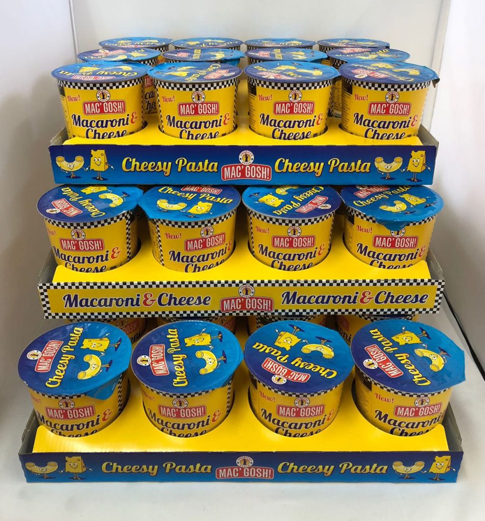
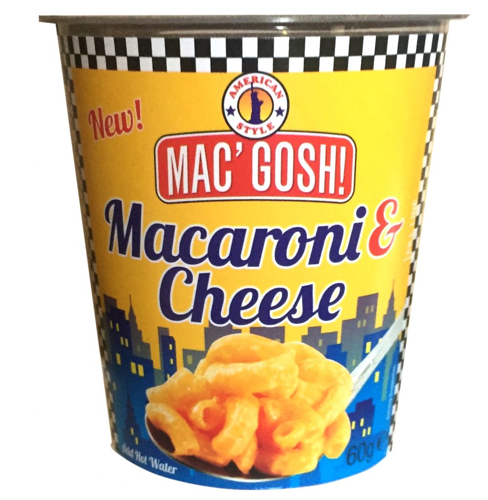
The brief on this new product was to; stand out from the crowd, to come across as a new product, to compete with other existing brands and to look utterly scrumptious gooey and very full of cheese! We came up with the American cab + Diner look to get across the American feel and to draw apart from the English staple of Macaroni Cheese. Along with this, the yellow with the black and white squares is a very memorable iconographic image and the yellow imbues a very cheesey flavour. Most of the other products on the market use a cyan blue as their main colour; not wanting to alienate the customer base, but to also stand out from the crowd, our predominantly yellow packs have a patch of bright blue – which also serves as a contrast colour to bring out the product photo.