Logo Design
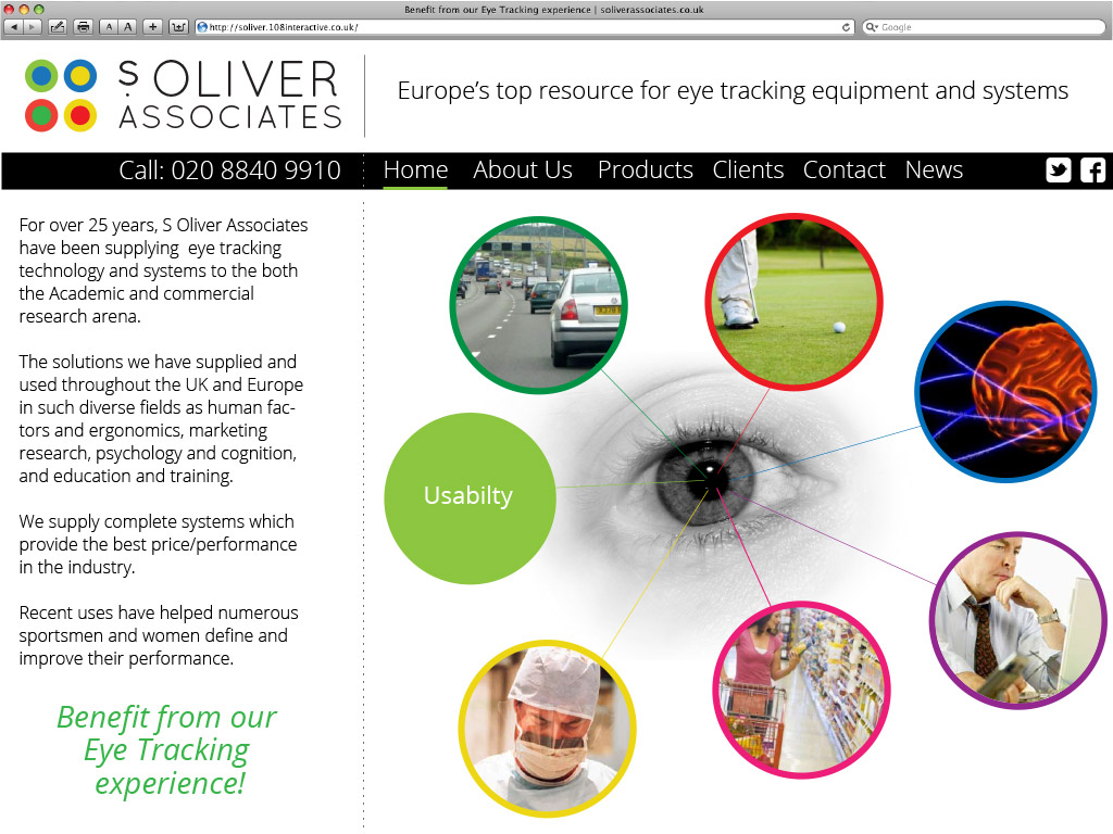
A specialist eye tracking company that was in need of a complete makeover from top to toe. We started with the logo and supplied various concepts in search of a much more evocative and explanatory image, along with being more modern and memorable to attract the younger market the client wanted to engage with.
We came up with the logo above as the colours within the circles, (relating to the orbs of the eyes), make our own eyes react and move around – much the same as what happens when eye tracking is used. So in effect we have actually created a logo that has a physical effect on the eye in relation to the business, as well as looking pretty smart too!
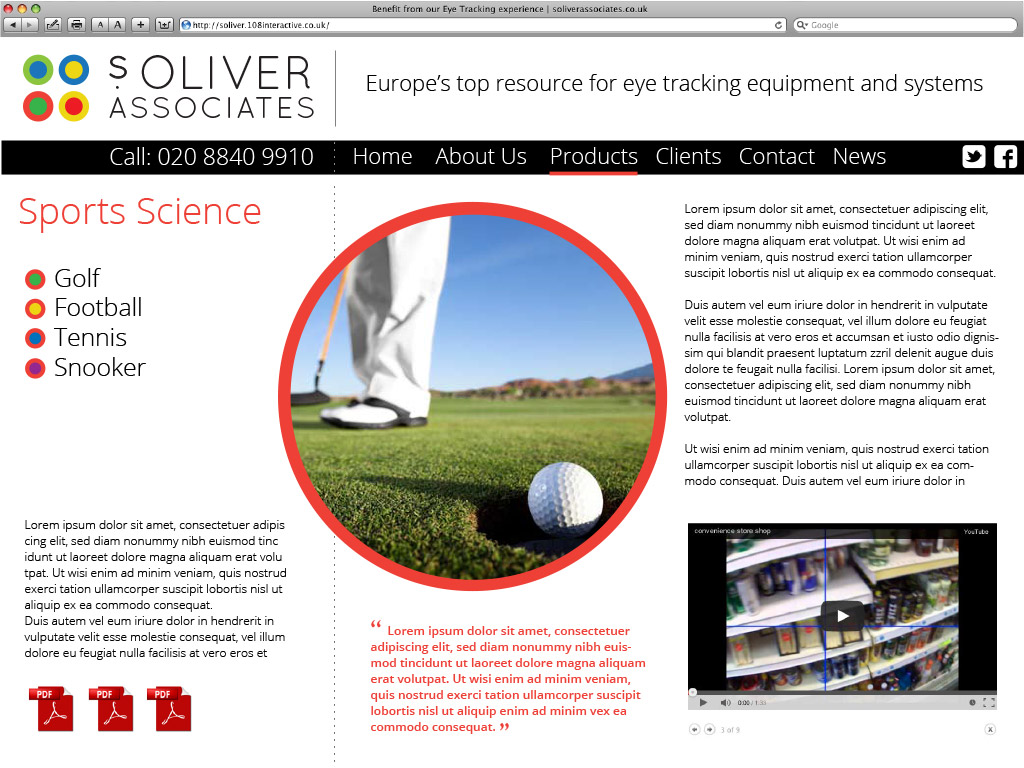
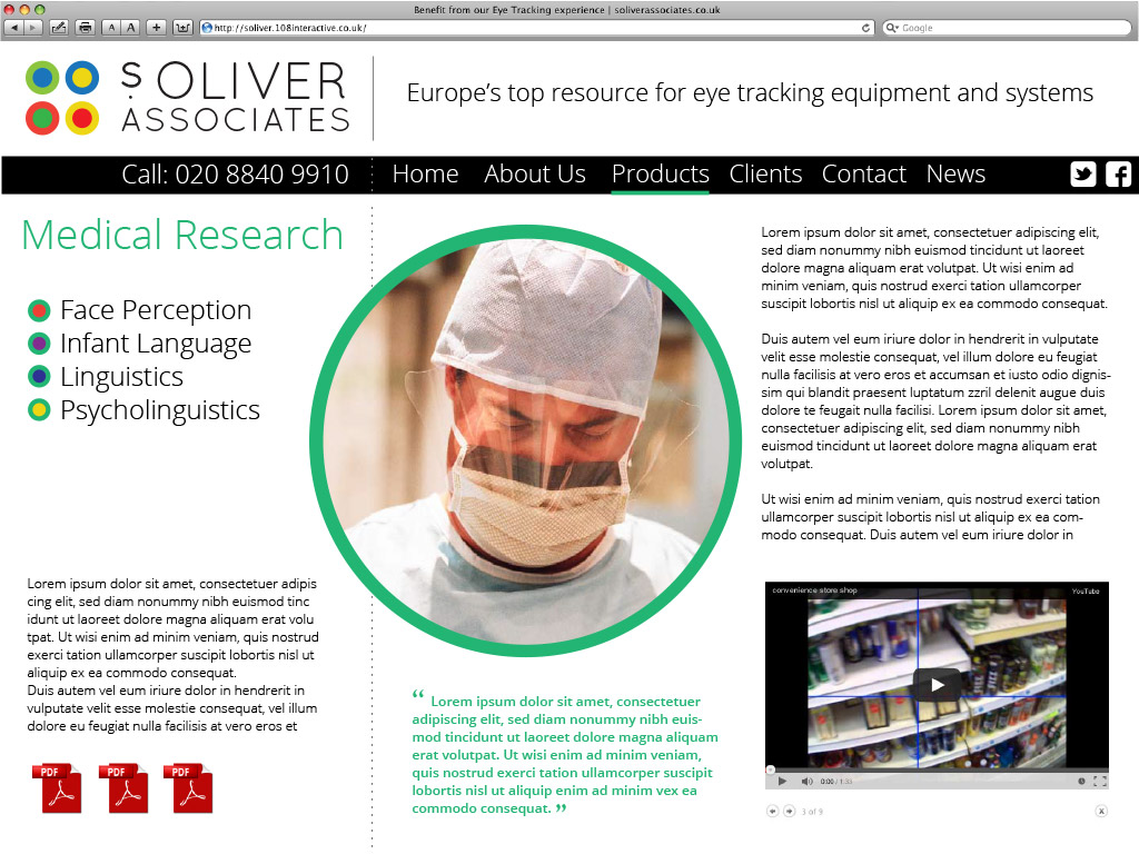
We then developed some web site ideas.


